Lily Paris Jewellery Magento E-Commerce Build and Design
We wanted to share here on the Primal Space blog today, a post about 1 of the Magento e-commerce projects we have been working on recently for Lily Paris Jewellery. The project is almost complete, with around 80% of all of the work now done to bring the website build to completion. We have handled and will continue to handle, everything from graphic design, content management, online branding, website design and online marketing for this client.
The website has been built using Magento software. Magento is the only software we will use to build online retail websites. In terms of open-source e-commerce platforms out there, it is simply the best and has been for at least 5 years now. It’s easy to see why it is the most commonly used software worldwide. Our e-commerce agency in Scotland is a specialist in design, development and execution. As leading Magento developers we’re here to support you every step of the way. This is why we’re chosen by businesses of all sizes to handle their store builds and ongoing updates.
E-commerce Jewellery Store Design
The design brief given to us for Lily Paris was to create an elegant, yet modern boutique for women’s jewellery to be purchased. The website features a simple-to-use search function, product wishlist and product compare function too. As it stands the website has around 300 products live in the catalogue, with another 1500 pieces dropping in over the next few months.

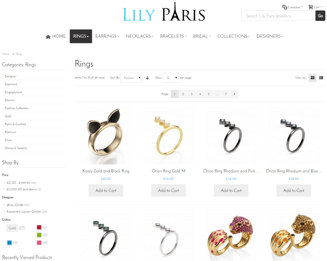
Lily Paris Category Page
One of the main concepts was the idea of keeping a clean design with a lot of white space. Letting the content stand out and be very transparent to customers shopping online. The brand is to be portrayed as a high-end one, with simple fonts used throughout. As well as a simple logo design, incorporating the Eiffel Tower within the logo.
The category page was to feature clean and minimal filters, including a colour swatch filter. Allowing the customer to easily filter by colour or metal.

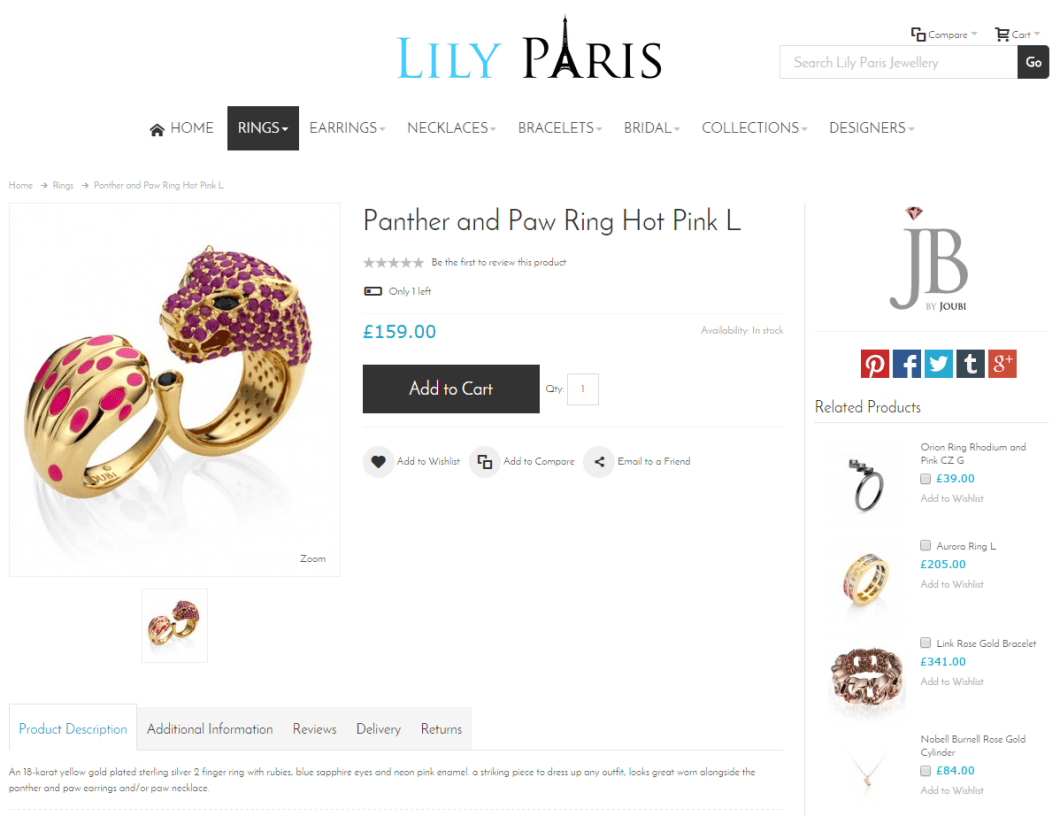
Lily Paris Product Page Screenshot
Selling From Your Own Online Store
The product page (screenshot shown above) keeps in theme with this clean layout concept. Tabs have been used to keep content like the description and product attributes well laid out on the page. If you look at the website on a mobile or tablet device, you will see the area has great functionality too. Simple social media share icons and links are featured too within the product page design. So much of the jewellery on the website can be easily shared on Facebook or the like by the user.
The email-to-a-friend function to is a popular one used by consumers. Particularly for this type of product that is often bought for them as a gift. There are still some finishing touches to be made to various areas of the website. But it is more or less there now and the website is live for all to use.
If you’d like to discuss a new web project or updates to an existing online store then share your requirements. Our team at Primal Space will be in touch.
