Elementor User Guide
This Elementor user guide for WordPress will provide you with all the information you need to confidently update your websites pages and content with ease. Throughout this guide, we’ll provide simple step-by-step tutorials on how to navigate the most commonly used functions of Elementor. Giving you freedom and flexibility to confidently update your site ongoing, as and when you wish.
We’ll continually add content to this post to provide as much information as possible. So if you feel like there is something missing. If you’d like to learn how to perform a particular action, then please do drop us an email. We’ll be happy to add to this post to make it as useful as possible for our clients to utilise.
What is Elementor?
Simply put, Elementor is a page builder for WordPress, similar to the recently launched Gutenberg block editor. The drag-and-drop functionality of Elementor provides an easy-to-navigate system for adding content to your website pages. Making it easier than ever for people, without a coding background, to create beautiful and functional websites. Without all the technical know-how of experienced developers. Making it so much easier to continually update your website pages. Long after the initial design and set up by your website developer.
The fact that Elementor is a visual editor means it can be used by anyone, regardless of their skill level. As it shows the content as it’s displayed on the page. So no more guesswork, or constantly having to navigate between the front and back end of your site. This intuitive platform means that it’s never been easier to take control of your websites content and update your website with ease.
Elementor User Guide
Like learning anything new it takes time and patience. We hope this Elementor user guide provides you with a helpful starting point. Luckily WordPress provides a user-friendly interface. So once you’ve mastered a skill, it becomes very easy to apply this ongoing. In this post, we’ll cover the basics. However, there are more in-depth Elementor guides should you wish to explore them in more detail.
Accessing Elementor Editor
It’s easy to access Elementor from your WordPress admin area. Simply navigate to the page that you wish to edit and select ‘edit’ to open the page.

From here you’ll be able to click on the Edit with Elementor button which will show on the middle of the page. This will open the front-end editor in the same tab.

You’re now ready to start editing your page.
The Elementor Menu
Once you’ve clicked on the Edit with Elementor button, the editor will open. This very much resembles the frontend of your web page. The left side of the page will show the Elementor menu, which is where we’ll locate all of our page elements and widgets to allow us to create our design.
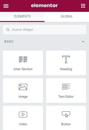
We’ll talk through the specifics for some of the most used elements that you’re likely to encounter when updating your page. If preferred, you can use the drag function to make this menu wider or narrower on the page as desired. When you hover over the adjoining line the arrows to engage his function will appear.
The right side of the screen opposite from the Elementor editing panel will resemble the frontend of your page as it would be viewed online. Albeit with a few additional features. Including an add block dashed box, with a plus icon and a folder icon. This is where we add new rows to your page, allowing us to drag and drop elements from the left hand menu to build the page.
Let’s take a closer at this area of the page and how it works.
Adding a Row
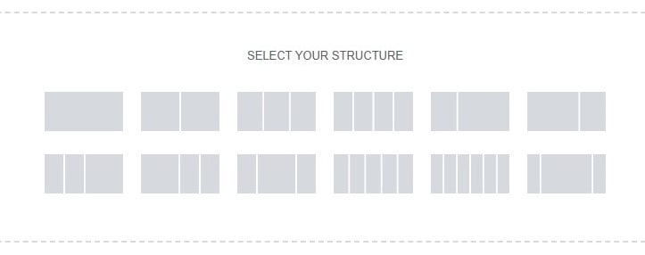
To add a new row to your Elementor page, simply click the plus icon to open up further options. You’ll then be able to select the format of your new row based on the number of columns.
For this example, we’ve opted for a two column row. This will then appear above on the page with a blue outline. While more editing options will have appeared in the menu area to the left of the page under a tab called layout. Here you’ll be able select various options for your new row. Such as the format the it will appear on the page. For instance, if you’d like it to be a boxed or full width row. Or if you’d like to add gaps between the columns of your row. As well as other options such as row height and alignment.
The second tab, Style, provides visual editing options. So allowing you to modify the colour of the row, or adding images to the background of the row. You’ll simply want to navigate to the paintbrush option and then select the colour you’d like to add or upload the image from here from your media library.
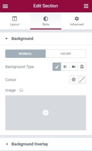
For colour options, be sure to use colours that are already within the theme of your website to keep the design consistent. Your developer will have provided you with these hex colour codes or they’ll be found within your WordPress admin area.
The third tab along provides more technical advanced features for editing your row, for example adding a parallax function or adding custom css.
Saving Your Work
When making any changes in the Elementor menu, be sure to always save your work to the page to allow you to view them in the live area. This is done easily by using the green button visible at the bottom of the Elementor menu.
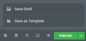
If the page is not yet live, we would recommend using the drop down and using the ‘Save Draft’ function. Ensuring your page isn’t published live on your site incomplete. You can then hit the publish button when you’re finished your design and completely happy with these new changes.
Editing a Text Block
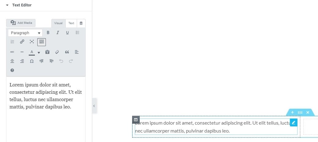
Next up in this Elementor user guide, lets take a look at the text block function. Which is something you’ll regularly use when editing your sites content. We’ve dragged a text editor block from the Elementor menu shown above into a column of our new row. To edit this column we’ll then hover over the row and click on the small pen icon. (Located in the top right corner of the text box). The editor will then appear in the left hand side of the page, allowing you to add your own text here, replacing the dummy text which is the WordPress default.
Here you’ll recognise the familiar editing functions that are present within your WordPress dashboard, allowing you to customise your text, adding styling, and hyperlinks etc. You can also navigate through the styling and advanced tabs to allow you to use additional tools and features. As always, ensure to save your changes when you’re happy with them.
Editing an Image
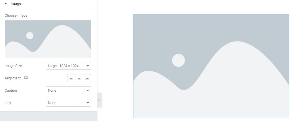
Another commonly used function you’ll encounter when updating your website is adding or updating an image. Firstly to add an image you’ll simply drag a blank image element from the Elementor editing panel into a block of your page. Once this has landed in it’s desired position, this will open the Elementor image editing tool. Alternatively, if you’re looking to edit an image on the page, simply click on the image and the editing tool will also open.
To add or replace the image firstly click on the box below where it says ‘Choose Image’ to the left of the screen. This will prompt the media library to open and you’ll be able to select a pre uploaded image from your WordPress admin area or upload a new one. We would always recommend the later, as it’s always important to ensure the image is the correct size to fit the specific area within the page. You can read or post about resizing images for web use to learn more.
Once your image has been resized correctly and added to the page, you’ll be be able to work through some editing options. Such as alignment and also have the option to add a link to the image so it acts as a button upon click. Styling and advanced options are also available for more technical edits that you wish to perform. As before ensure to always save your changes.
Adding a Spacer
Spacers are often used as a way to make your web page more visually appealing. So ensuring that your content isn’t all bunched together. While allowing a call to action to stand out among other areas of text. Here at Primal Space, our philosophy is to create clean websites that keep our clients content at the forefront. Utilising white space as a tool to ensure the main thing remains the main thing. So that your message isn’t watered down or missed by your websites users, hidden behind complex page layouts and distracting visuals.
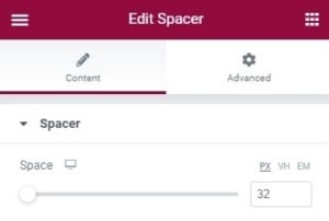
Adding spacing is simple as it’s another element provided within the Elementor menu area to the left of the page. Simply drag and drop this to your desired location. Then use the editor to decide the size of this spacer is driven by changing the number in the box.
You’ll be able to see your changes appear live in the frontend of your site to the right of the page so will immediately know when you’re on track.
You can also create spacing from the element it’s self. It’s a little more complex but easy to navigate when you know where to look. This is particularly useful for adding gaps between rows. For this method, you’ll firstly want to select the blue tab at the top of your row. Opening up the editing options for this section in the Elementor panel. Next we’ll navigate to the advanced tab and edit margins.
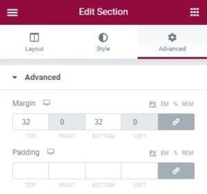
When you enter numbers within these boxes you’ll see spacing appear between the rows on your page. Don’t forget to save your changes.
Duplicating Elements
We’ve already taken a look at the pen icon within this Elementor user guide, located to the top left of an element for editing. However this button also has a right click function which allows you to duplicate an element, such as a text block, button or image. A really useful feature that you may already be familiar with from the WordPress admin area.
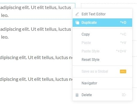
You can also use a similar function to duplicate an entire row in Elementor. Simply right click at the top of the blue border for the section you would like to clone and the duplicate option will appear on the menu.
Why is this helpful? Well often we can spend a lot of time perfecting the settings for a specific row. And most often pages are made up of a few, repeated, very similar rows (particularly those with text and image blocks). Therefore the duplicate feature allows you to save time on this task.
So instead of manually creating every element as new, you can duplicate it and replace the relevant text and images as required.
We would also recommend using this function if you’d like to modify an area of your design created by a web developer. Simply duplicate the row, replace the content as you wish and then delete the old section once you are completely happy with the new design. This allows you to make changes with a safety net. Knowing you can always revert to the original design if at any point you’re struggling to make the desired changes or feel out of your depth.
Deleting Elements
Once perfecting your new design or replacing your content on your page. Perhaps you’ve decided to delete parts which are no longer required. It’s really easy to do this and uses the same right click function as we’ve outlined above when duplicating a row or element. Simply follow the same instructions but navigate to the delete button on the pop up which is located at the bottom of the menu.
Returning to the Elementor Menu
After editing a specific element, it’s easy to return to the Elementor editing panel home screen. Simply click on any of the space on your web page outwith the row content. Or click on the icon with the squares to the top right on your Elementor editor. Here you’ll be able to move on to the next task.
Should you want to edit a specific block simply click on it, and the editing options for this specific area will appear.
Previewing the Page
An important function viewing your changes before publishing them live on your site is the preview function. You may have noticed the eye icon to the bottom of the Elementor editor beside the green publish/save button.
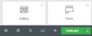
When clicked, this will open a new window. Showing a preview version of your site with your current edits. Here you’ll be able to see the changes before committing to them and publishing them live on your site. A feature we use regularly to get a feel for the look of a particular area, and what it will look like from a UX perspective. We would recommend using this function often, and regularly checking your changes in the preview mode before saving. There’s nothing worse than spending hours on a task and then previewing it only to find that it doesn’t quite work as planned and having to start over. Preview allows you to overcome this early on.
To Conclude
Hopefully this Elementor user guide has provided you with some guidance and support. As well as a helpful starting point when navigating and updating your Elementor driven WordPress website. It can seem daunting learning something new. Like learning anything, it takes time and patience. But rest assured, Elementor is extremely user friendly. From our own experience, we’ve found that once you grasp the key functions of the elements outlined within this post. The rest is easy to build upon. Allowing you to update and make changes to your own website, confidently and with ease.
Our aim through this Elementor guide, and other WordPress user guides for Gutenberg, WPBakery Page Builder and Visual Composer is always to help you build confidence and skills to enable you to update your website in-house. As websites that’s constantly maintained, updated and includes fresh new content always rank highly on search engines and drives SEO. You can come back to this Elementor user guide time and time again. Or if you have a question about something specific that isn’t included within the guide, then don’t hesitate to reach out.
Alternatively, if you’re interested in finding out more about Elementor development then feel free to submit your requirements to us. Our team here at Primal Space will be in touch to assist you.
Did you find this post helpful? Feel free to share it.


