New Primal Space Website Launched
We’re incredibly proud to announce and share with the world our new Primal Space website design. It’s been a long time coming! We hope you love it as much as we do.
Following our 3rd Birthday on the 2nd August, we’re excited to finally share with the world our new Primal Space Website. We’ve been working on it behind the scenes for months and months in the background. And have been so busy making beautiful websites for our clients. That our own website re-design has taken a back seat. But we’ve finally got it over the line and are thrilled with the new layout. Which we’ll be able to update and build on continuously for many years to come.
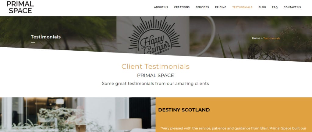
One of the main purposes of the re-development of the new Primal Space website was to make it load faster. With streamlined code. But still loading lots of colourful content. All of the old pages are on the new website. Just revamped a little. Some new pages have been added. Including an FAQ page. As well as a testimonials page showcasing some of the lovely feedback we’ve had from clients.

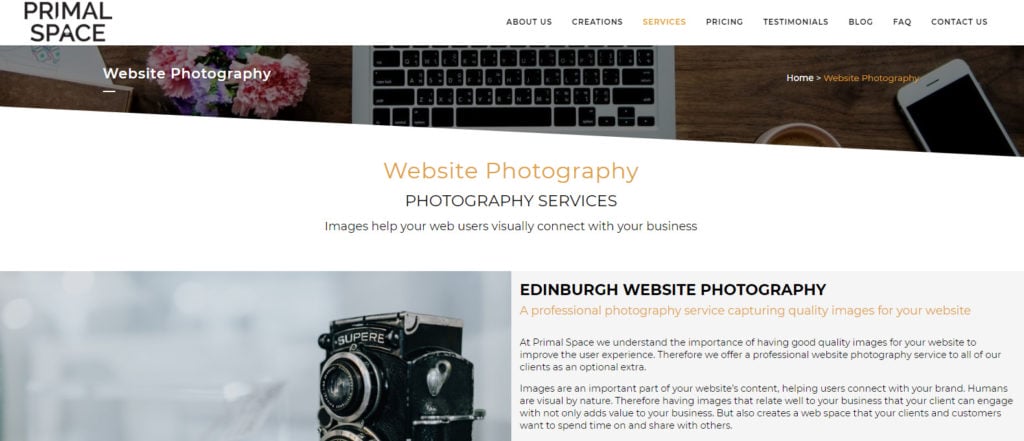
Not only this but we’ve also minimised our service pages into more concise pages. Making it much easier to navigate your way around. We upgraded this with the intention of improving the user experience, which we believe it has. We’ve also removed older services that are no longer offered and added a few new ones that we’ve recently taken on-board. Such as website performance, digital marketing, website support and website photography. Something that we know will help our clients massively.
On a whole, the entire site is modern and up to date with a more professional feel and a cutting-edge design. We’ve grown up a lot in these last few years, and we wanted our web pages to reflect this. While still keeping a little bit of humour, we hope some of the images used will make you smile!

Our new Primal Space website also incorporates breadcrumbs within the design. Because again we aim to deliver the best possible user experience and make it as easy as possible to navigate your way around. By removing numerous WordPress plug-ins that slow the site down. As well as moving to a faster server. Mean that we’ve been able to have the site loading faster in all browsers. Something that was a key priority throughout the planning stages and the design process.
We’ve also made several technological advances with our new website. Not only using the integration of Visual Composer, which has allowed us to create a more attractive design overall. But also allowed us to incorporate elements and interactive features that present the information on our web pages in a more interesting way than before. We’ve also moved away from an old WordPress theme that was no longer updated to a newer, sleeker theme that we know will carry us into the future. Keeping our web pages current and appealing to users for many years to come.

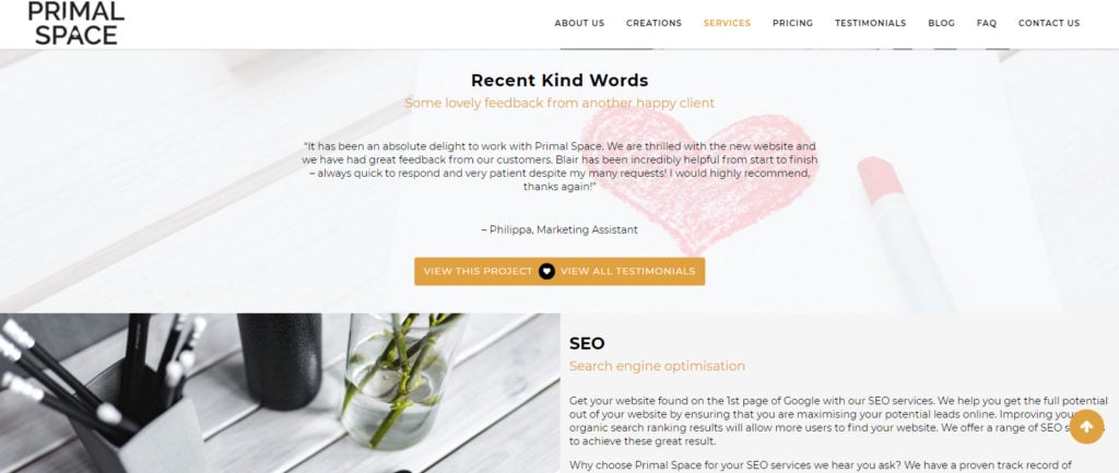
Furthermore, we’ve migrated the site into the WordPress multi-site framework. This function allows us to create a network of multiple websites, all running on a single installation of WordPress. While one of the most significant improvements we’ve made is in the on-site SEO setup. Ensuring that our website is ranking high on search engines and picked up for all the best reasons by Googles algorithms. We’ve done this by implementing all the tried and tested techniques that we’ve been using on our lovely clients’ websites for the past few years, and seen great results from.
It’s been a long journey. But we wouldn’t change it for the world. And we’re really pleased with the final outcome of our new website. Let us know your thoughts on the new design? And if you have a web design project of your own in mind, please don’t hesitate to contact us. We’d be happy to help you bring your ideas to life.
